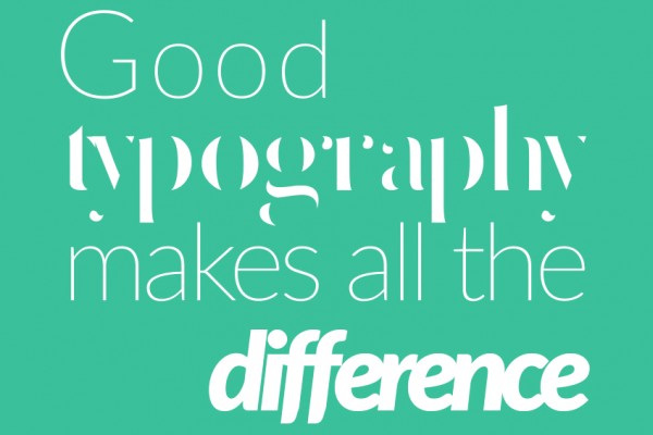
Typography is the visual representation of language and most of the times we are not aware of its importance when we are reading online. The truth is that it is inextricably linked to web design and is what makes a great difference for websites. Even though it is not obvious for everyone, choosing the right language is not enough, because how this language is represented is also essential.
We generally speak about typography, as the technique of arranging type, but most commonly, people speak about fonts when they have to choose how they want to visually present their texts. The family of fonts is the typeface and at a closer look their anatomy is somehow complicated.
Creating typefaces has definitely evolved and when building beautiful writing, typographers or graphic designers use an exact terminology to determine the anatomy of the letters: stem, baseline, ascender, descender, counter or serif are just a few examples. Maybe this is not relevant when choosing the font for your website, but here is where everything begins.
There are some popular typefaces everyone is using, no matter the context, but is this the best solution, to follow trends? Here are some guidelines that will make you think twice before going for the Cambria, Helvetica or the classical Times New Roman.
Knowledge is power
Gathering as much information as possible will be crucial in deciding upon a typeface. First of all what is the text about, what information, thoughts, news, ideas is transmitting? Content is not there just to fill in the pages, but it has a purpose and relevant content should be presented adequately. If the website has a formal approach, then the typeface should reflect this.
How does your audience look like, which is the average age or what interests them on a website like the one you have? The typeface should be appropriate just like clothes are chosen depending on age. You don’t want to see a 74 year old lady wearing a mini skirt.
Once these aspects are covered think further. A common dilemma is whether it is ok to use several typefaces for the entire website. There is some flexibility in this area because it is not mandatory to stick to one typeface, but it is not recommended to use more than two or three of them, neither.
Several fonts belonging to the same typeface could be accepted, but expanding the variety will make the website look like you couldn’t decide what to choose or even worse, it gets cluttered and more difficult to follow. Mix and match it to get focus on certain areas by using several versions of the same font or by playing with weight or color.
Guided by practicality
There are quite a bunch of details that have to be considered, but practicality should be kept in mind all the time. No matter the circumstances texts should be easy to read and to understand. In the online there is no room for cluttered letters, crammed line-height or tiny fonts.
What else should practicality mean in this context? To choose the typeface that will adapt on every device, which will be readable on a small screen and on a wide one as well. Consider also the hierarchy. Generally, titles and headlines are bigger but emphasis can be also achieved through color or weight.
After all the points made here, intuition might also have something to do with it. Some people just know how to match everything and deliver an astonishing result. Of course that experience and an artistic eye can help. Be bold and just follow some simple steps in your quest for the perfect typeface.