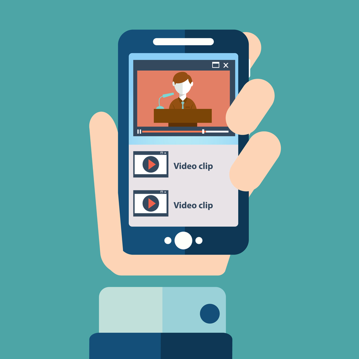
Over the years website design has changed considerably and since technology is continually evolving, there are always other factors influencing online trends. Recently, web design has been inspired and strongly influenced by mobile devices, thus websites are starting to be moulded by the requirements of the mobile market. Nowadays almost anything is possible on websites or smartphones in terms of design and more options bring more opportunities.
There are so many choices out there, that once you want to create a website, taking a decision is getting tougher. However, what is important is to follow some simple guidelines and the main trends in the field.
The long-lasting and evolving trends
Hero images: This is one of the biggest trends that settled a while ago and is getting even bigger. What is a hero image? This is the image on a homepage, that covers the full screen therefore from the beginning it brings that “wow factor” to the users. The image should present in a concise manner what you can find on the website and what is the content about. This is a frequently used theme because it draws the attention from the first moment and it conveys a message through a simple image that becomes the symbol engaging visitors and inviting them to explore more.
Semi-Flat design: Last year you could see everywhere the flat design that in the beginning was known as material design, a visual language developed by Google. The trend is evolving and is now combining the flat elements with more realistic details. It got bigger with the arrival of more applications for mobile devices and what makes it so good and catchy is the focus on colour and layout. This is minimalistic, simple and clean relying on colour to transmit a message, engaging users through graphics and symbols that lay stress upon the hierarchy on the page.
Scrolling is a huge factor to consider because the trends, nowadays, are leaning more on scrolling than on clicking. This feature can add several benefits like a faster response from the webpage; the entire content is located on the same page and offers a more dynamic experience. This also gives a greater interaction between the user and the interface and it is versatile since it looks like you are sliding the finger across a touchscreen.
Storytelling is something that more brands rely on because it touches people on a profound level. Enabling them to relate with something familiar through strong images that have emotional stories is not a cheesy strategy, but a key to success.
The fonts are more diverse than ever and typography is getting more attention from web designers. They are getting bolder and they reiterate a strong statement.
Trend predictions for 2015
Creative illustrations are booming and they are becoming more interesting. The playful, hand-drawn illustrations evoke creativity and uniqueness, something that is highly appreciated these days. Thus, we expect brands to rely on talented illustrators to help them differentiate on the market.
Since huge images at high resolution are already in, we foresee a tendency towards big background videos that will reveal the true soul of a company or a brand.
Furthermore, the online world is assaulted by GIFs for a while now and it is probably no coincidence that they receive more attention. Cinemagraphs can take less to create than a high quality video so they might just be a great alternative for the hero images. Through cinemagraphs storytelling can become even more captivating and dynamic.
Going on the same direction, there is a disposition toward magic worlds, hand-made creations, sensitivity and humanity. This magic world could get more realistic through design and closer to the users’ lives.
One thing is clear: no matter the option one will choose, web and app design is getting bigger and it is offering greater opportunities to succeed online and offline.